Trade Me is the #1 place where Kiwis buy and sell online. We’re the leading online marketplace and classified advertising platform in New Zealand. Mainly I was working on the Yellow Trade Me app for iOS and Android. I began working in November 2017 in Christchurch, New Zealand and I was working on multiple projects.
My Role: UI/UX mobile product designer
Tools & Methods: Contextual inquiry, surveys and user interview, affinity mapping, archetype & customer journey map, wireframing, rapid prototyping and usability
Project 1 – Deals channel on Trade Me
How can we encourage more people to buy new goods and find the best deals?
Problem
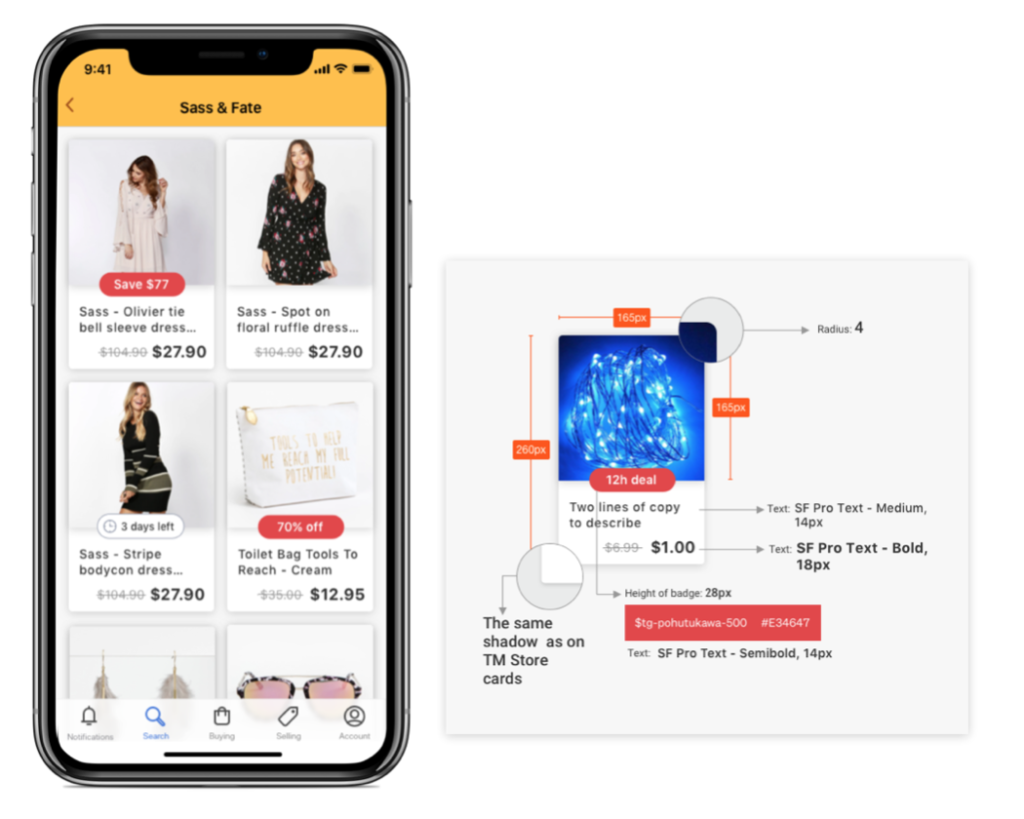
The problem was that it’s a new feature to Trade Me. The goal was to build a Deal channel where users can access and browse deals every day. And it must be available within Trade Me.
Solution
Our solution focuses on running different experiments and based on our analysis finds the best solutions, including increasing awareness and accessibility of a Deal channel for Trade Me users. In the broader sense, this could ultimately help change people’s attitudes and behaviours on searching experience inside the app.
User Testing
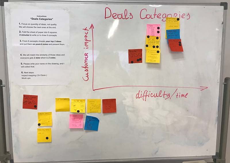
The iterative development we were using to make this lends itself to running street tests and user tests. Initially, we run user interviews to gain insights and research purposes to better understand user preferences when it comes to deals, along with competitor analysis. We checked the concept before building anything by mocking up existing deals within the yellow app’s chrome and seeing how users respond. After that, we rolled out to small numbers of people to check and tweaked to see how customers responded.
Discovery
Mainly we found that – Joy of shoppers love mid-low prices items. They love bargains and respond to FOMO. They are visual shoppers and can’t resist if something catches their eye. They will check back frequently.
Screenshots
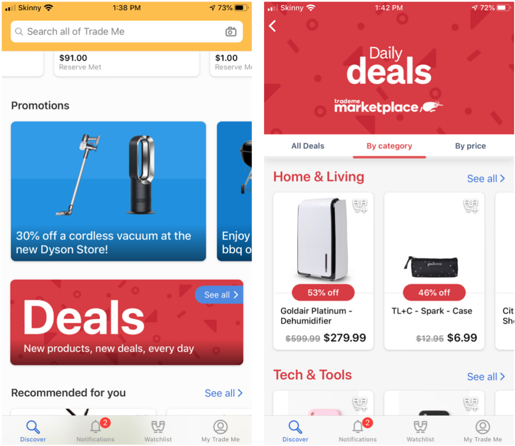
Giving users the ability to access and browse deals available within Trade Me – It’s life right now in iOS and Android.
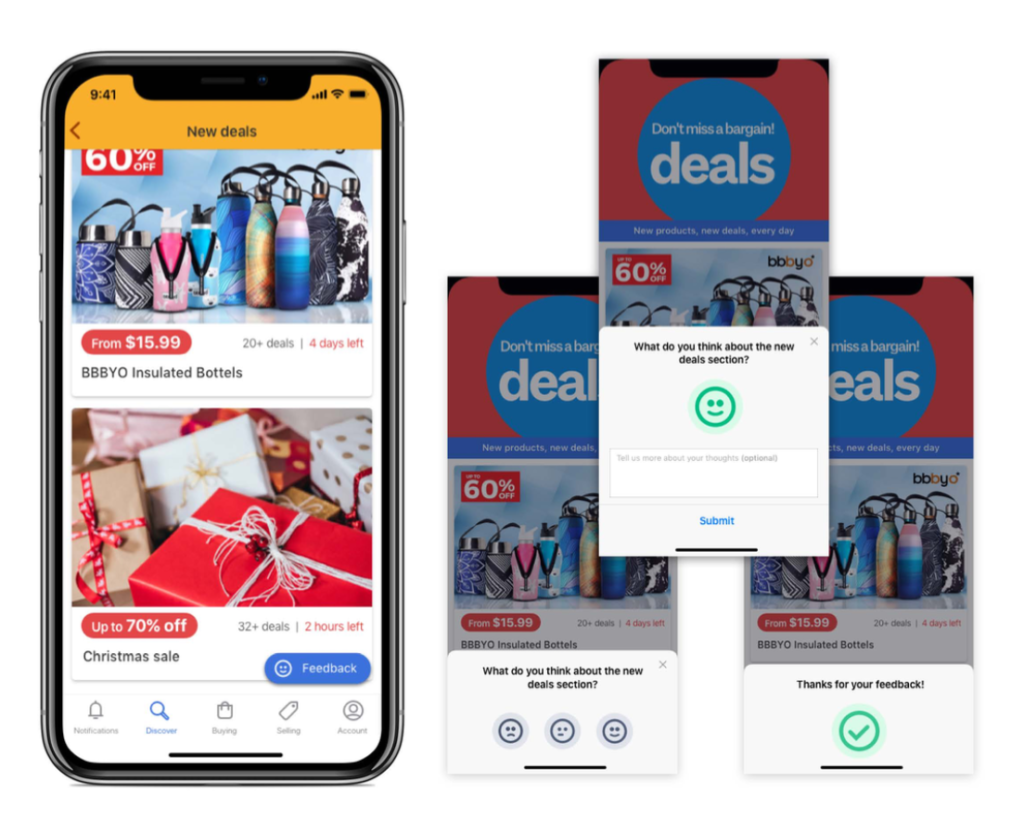
It gives a way to instantly survey customers opinions on new features, deals or experiences.
Project 2 – Stores on Trade Me
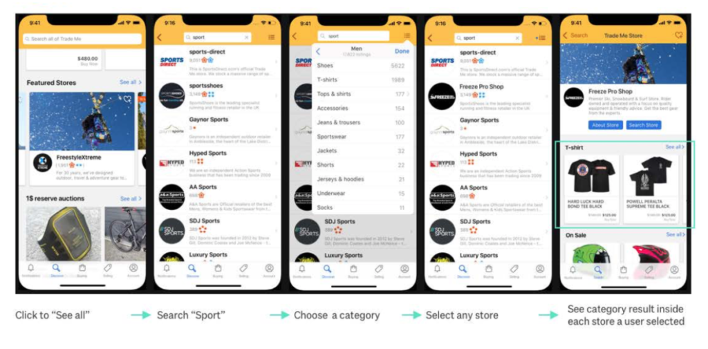
We know that many people are unaware of Trade Me stores and new goods. We want to make stores more visible and educate people through the mobile app that we have new and not just used items.
We also want to clearly display new items from Trade Me stores when people search without filters, providing a good experience to people searching for new goods easily in one app.
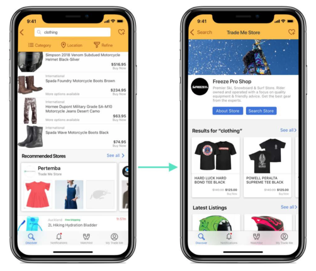
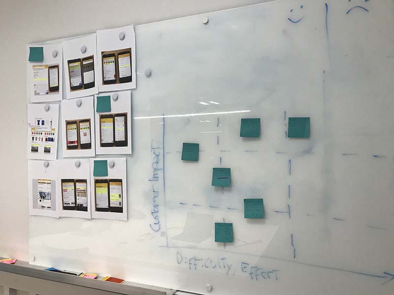
We run many experiments, brainstorming, impact mapping sessions and user testings around Stores on Trade Me.
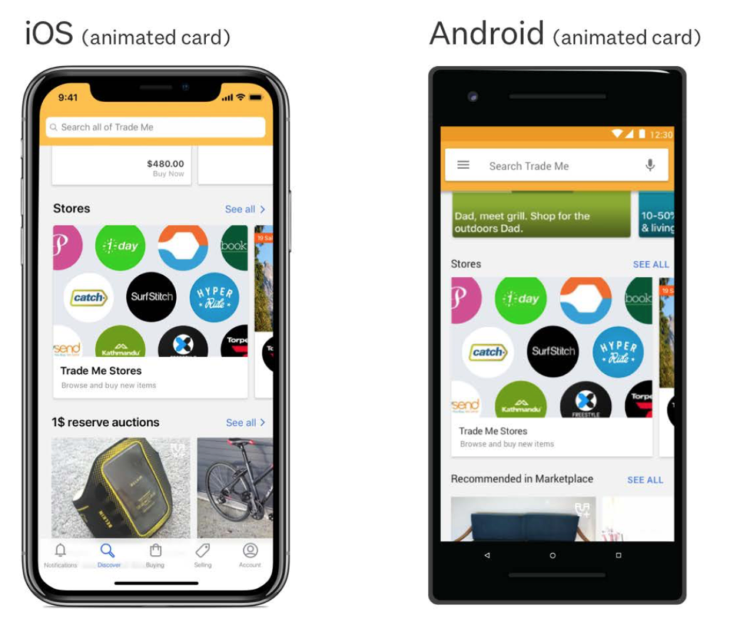
Store Directory is hard to find, users may be unaware of its existence. Many of these unaware users may be interested in shopping and browsing stores. We are also not being consistent with web behaviour by not providing a link to the store in the marketplace.
Project 3 – Afterpay experiments
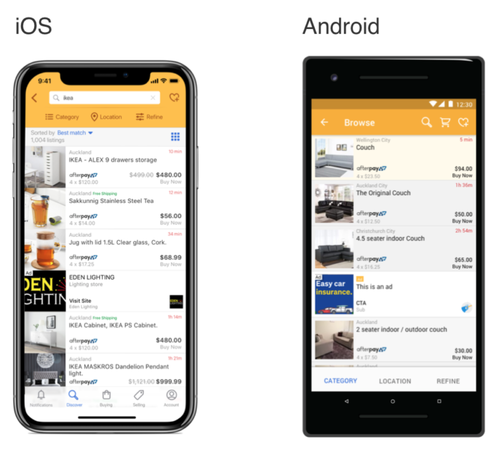
The problem – experiment 1
By displaying the Afterpay price in the search results we make it clear to the user that the listing supports A
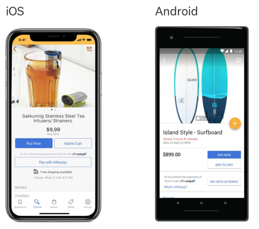
The problem – experiment 2
Afterpay has relatively low visibility in the apps, it may not always be obvious to the user that Afterpay is an option. This could be holding back additional growth and purchases made using
The problem – experiment 3
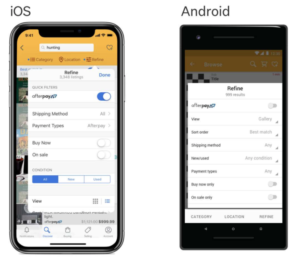
Adding a quick way to filter all listings results to Afterpay only listings will make shopping on trade me a lot easier for those who use Afterpay. It also adds additional interest and exposure to those who may not be familiar with Afterpay.
